Period Poverty: Applied Arts
This project was focused on raising awareness and bringing in donations for those who suffer from period poverty in our city and the surrounding area.
After doing some initial research for the assignment, I didn't realize how many individuals suffer from not having the proper products while menstruating. It's a problem in our world that not enough people know about, or care to learn about.
The design work throughout this project fluctuated the whole time. From scratching ideas to redoing certain photos, changing the type, and all around doing a complete 180 with our idea. This project was tough, but the donations that were raised towards it were record breaking in our city.

From left to right: These were our first designs. The slogan "Bleed with Dignity" was something that had to be included in the design.
Our initial thought was to portray a Times Magazine, with the red border, bold-serif type, and text around the centre photo. We felt that this communicated an important message because the Times Magazine is looked at as very communicative, recognizable, and news worthy. Which is why we picked the theme.
After the critique with the head of the project, she mentioned that it wasn't "bold" enough. The previous year this project was done, the group also did a magazine style poster, and she wanted to veer away from that design. So we once again, had to pivot.
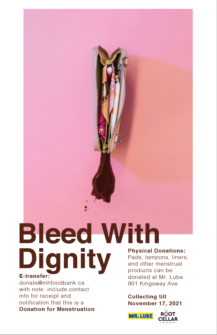
Taking inspiration from the Pantone cards, we cleaned up the design a little bit. With emphasis on the text and the image, we felt that this design was more clean and concise, as well as communicated the message better because the text is easier to read.
Our idea with the wallet and money, was to create something that looked like female genitalia. This is not only one way to communicate design, but it is eye-catching when someone would walk past this poster in a hallway or store.


